
Category: Human-Centered Design

  • Design as Bricolage.

    Design as Bricolage.

    When attending a boundary-spanning design meeting the other day, I was reminded of how important pattern sensitization is to design. When we explore a new problem-situation, we structure it according to the patterns that we perceive in that situation. This is why experienced designers are so much better at design than novices. It is not that experienced professionals are sharper, or better at design — but just that they have a wider repertoire of patterns to call upon. As they recognize familiar elements of the situation, they fit partial solutions to those elements. Problem decomposition is not hierarchical, in the sense proposed by Alexander (1964), but convergent. The problem-space and the solution-space co-evolve, as designers explore these in tandem (Maher and Poon, 1996; Maher and Tang, 2003).

    Back to the meeting.
    A group of strategic managers (including the systems people and the business process change manager) were examining how to revise business process support for a routine workflow. The problem that they faced was that this had been adapted by several workgroups (whose representatives were present) over time. So each of these managers had a different perspective of the problem, depending on what each group was trying to achieve. The customer support group were frustrated that they could not access all of the customer information in the system, but had to call another group to obtain missing information. The order-processing group were frustrated that they could not track the progress of an order without having to run three separate IT applications. The sales and marketing group were incensed that not all of the latest products and services were publicized on the website. None of these people – including the IT group managers – could see that these were related problems. They spent hours debating the fields to be displayed on the screens and the detailed reports needed, without realizing that the workflows were related.
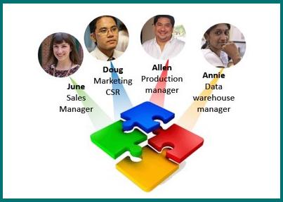
    The breakthrough came by accident, when the Process Improvement Manager was mapping the “requirements” on a whiteboard. He started to link two of the requirements, stood back and then said “So this step is also related to this one, isn’t it?” Then the Marketing Manager said “That comes just before the promotions stage.” As the Process Improvement Manager drew a process diagram, each individual kept adding in pieces of the puzzle, with how they were related.

    Design as bricolage.
    Bricolage involves repeated “trying out” and experimentation until a pattern is discerned that is useful. (The word derives from Bricoleur, a French term meaning “handy-man” or “jack- of-all-trades.”) Claudio Ciborra described bricolage as “the constant re-ordering of people and resources that is the true hallmark of organizational change.” 

    Bricolage is based on leveraging the world “as defined by the situation” (Ciborra, 2002).  This process is not random experimentation – it is the construction or creation of a design from the range of available things or ideas. In other words, bricolage is what we do when we call on the patterns – the arrangements of, and relationships between technology, people, and concepts – to which we have been sensitized. There is a fascinating article, just as relevant now as when it was written, that discusses “How The Refrigerator Got Its Hum” (Cowan, 1995). It will come as no surprise that refrigerators hum because …. refrigerators have always hummed.  But it is much more complicated than that. There was a point in time when designers had to make choices about which technologies to use. These choices are embedded in a whole set of assumptions about users, networks of power, and influence.

    Becoming aware of Pattern sensitization adds another dimension to bricolage. It makes us aware of the sources that we use as inspiration. Design can now be seen as an ordering of situation elements until they make sense according to previously encountered patterns. So design is like a jigsaw. Each person carries around a partially-completed set of jigsaw pictures in their heads. The core problem of design is to use a problem-representation that can allow people to communicate the structures in their “mental jigsaw picture” to others.

    References

    Alexander, C. Notes On The Synthesis Of Form. McGraw Hill, New York NY, 1964.

    Ciborra, C.U. The Labyrinths of Information: Challenging the Wisdom of Systems Oxford University Press, Oxford UK, 2002

    Cowan, R.S. 1995. “How the Refrigerator Got its Hum,” in: The Social Shaping of Technology, D. Mackenzie and J. Wajcman (eds.), Buckingham UK: Open University Press, pp. 281-300.
    You can check this book out of the Internet Archive to read the chapter cited – do look at the other chapters as well, because there are lots of fascinating ideas in this book!

    Maher, M.L., and Poon, J. “Modelling design exploration as co-evolution,” Microcomputers in Civil Engineering (11:3) 1996, pp 195-210.

    Maher, M.L., and Tang, H.-H. “Co-evolution as a computational and cognitive model of design ” Research in Engineering Design (14:1) 2003, pp 47-64.
  • Designing for Real Users

    Designing for Real Users

    Recently, I spoke with a colleague who was serving on a design committee for a new company intranet site. He kept coming back to the problem of determining the placement of the CEO’s vision message, as the interface was starting to look rather cluttered. A senior marketing consultant was the lone holdout against this obvious vanity item, to which the design team felt compelled to give pride of place, at the top of the landing page. It occurred to me that few people were likely to be interested in this item, or to understand its significance in terms of company strategy. Yet it was being allocated valuable real estate and other items – which intranet users would need to access frequently – were being buried in a complex menu as a result. The design group did not even consider allowing users to configure the landing-page layout, so they could place frequently-accessed information pages at the top.

    Design is not a one-size-fits-all activity. We are all the product of our experiences ~ no two people have the same perspectives. It is a common anti-pattern to design for people-like-us. 

    After all, aren’t web designers the most interesting, creative, and representative people in the world? 

    Yet most people are less interested in the mechanics and visual impact of web design than the average web designer. Yes – emotional design is important. But not as important as enabling the user to achieve the purpose of their visit by making content easy to find – and interesting.

    Good design focuses on customer visit objectives, to hit the sweet spot in the push vs. pull tradeoff. Content design and navigation tend to be driven by the firm’s business model – what designers want to push to the users of our website. This results in unnecessary frustration, as the user tries to achieve the purpose of their visit. UXD sweet spot design balances the firm’s push factors with customer pull factors: what they need from the site, why they need it (their visit objectives), and how they expect to locate it (comparative design exemplars). You can only discover these things from user research, rather than lazy-UXD.

    Figure 1. Hitting the sweet spot between push vs. pull in site navigation

    It’s easy to design a site that directs your users to the products, areas, and sales possibilities that your company wants to push.
    Not only is this less effort than worrying about what your users came here to find, but your manager will be pleased, as you are focusing on what matters to the company.
    Your users? Not so much …
    …In fact, they may try to avoid your website altogether, visiting only when they really have to …

    In conclusion, we tend to design systems and websites with a one-size-fits-all interface, where the priority and placement of various information is determined by designers. There are two problems with this approach:
    1. These decisions are often political, or driven by those who shout loudest.
    2. The worst anti-pattern in design is to design for people-like-us. Most people do not think like web-designers. They have different priorities and interests, based on the work that they do.
    We should let users decide what order they want to see which items, in interface design. Give them a configurable interface, so they can arrange things to suit their own way of working – and priorities.

  • Responsive Web Design

    Responsive Web Design

    I manage the website for an Animal Rescue shelter. I have been struggling with the design of the site for some time now, as I have some users who are still using IE6 under windows XP (on an SVGA screen), some who want to view the site on their mobile phones, and some who have really wide displays and think my two column design looks outdated (it does). While looking for a solution, I came across the concept of responsive web design. Because the reference I just provided is stuffed with code snippets (and I personally think it is obscure), I will point you instead to some really great examples that demonstrate how a website design can be responsive.

    There is a neat concept at play in most of these designs, where a webpage layout is segmented into multi-device layout patterns, that simply “flow” differently, depending on the screen size that the user will display the site on. But screen size is not the only consideration – images have to be resized to scale with the device and the performance of the device must be considered (it is painful to load a large, graphics-intensive page on a slooow tablet!). I was also musing that – most relevantly to this course – site menus and navigation toolbar interfaces have to be designed so that they will work on any device or layout. Which is harder than you’d think, simply because of the layout conventions that we use on a typical web-page.

    Off to experiment with scripts and pageflow layouts …

  • The Potential of Interaction Design

    The Potential of Interaction Design

    While browsing and working on a recent paper, I mused on the missed opportunity of interaction design. Reading Terry Winograd’s (1997) From Computing Machinery to Interaction Design, I was stunned to see how visionary this was, in the context of contemporary HCI thinking which focused on interactions with computer screen interfaces (still, sadly, the main focus of much HCI work).  Winograd saw computing as a “social and commercial enterprise” and saw the role of interaction design as situating technology within social and commercial processes. This thinking is related to Suchman’s (1987) Plans and Situated Actions: The Problem of Human-machine Communication, which saw human-computer-interaction as part of a stream of activity, located in the rationale of a wider sequence of tasks. While HCI theorists were fixated on task-analysis and screen-interface design, Suchman argued that we should see tasks as related to what had gone before and what was to follow.  Winograd argued that we should design technical artifacts to be useful in the larger context of social networks and the complexities of interactive spaces.

    I was reminded of this when reading a discussion of Don Norman’s (2005) Human-Centered Design Considered Harmful. In this essay, Norman argues that HCI designers focus on “human-centered design,” which he relates to support for tasks and artifact-interactions, when they should focus on “activity-centered design,”  related to the larger context of what people do. While I agree wholeheartedly with the sentiment (and applaud the fact that the idea will at last get an audience if Don Norman has taken it up), the concept of activity-centered design still misses the point that we need to understand how actors perceive their stream-of-reality, situated within both a social and a cognitive-processual context, for interaction design to fulfill its potential.

    In my 2003 paper, Human-Centered vs. User-Centered Approaches To Information System Design, I argued that human-centered design is not the same as user-centered design. User-centered design sees the human-being as a consumer of technology, whose reality is – somehow, magically – represented by the set of functions accessed via the computer artifact. This tends to be the focus of “traditional” HCI research. Human-centered design, on the other hand, sees the human-being as an autonomous individual, who may want to perform tasks in a different way, or a different order, to other computer “users.” They see the logic of what they do – and therefore the manner of its execution – as part of a socially-situated stream of activity that is meaningful to their understanding of work-processes and not some engineer’s idea of “best practice.” This means that design methods need to deal explicitly with problem inquiry, rather than just focusing on problem closure.

    In a new paper (hopefully to be accepted soon!), I have argued that situated interaction-design needs an analysis of two dimensions of the work that people do:

    • the formal vs. informal translations that need to take place, to locate work practice in both the social (unstructured-interaction)  and organizational (structured-interaction) worlds, and
    • the global vs. local translations that need to take place to locate work practice in both the situated and generically subjective worlds.

    Most of our design methods focus only on one quartile of this reality: the formal, structured world of data-processing. To really support interaction design, both education and practice need to take on a much wider scope.